The Pacific Islands Data Visualization Challenge asked entrants to tell a story about the region using publicly available data. I focused on the collision between rapid tourism growth and overwhelmed waste infrastructure — two forces that look like opportunity and look like crisis depending on which side of the equation you’re on.
The key tension: tourist arrivals per capita in many Pacific islands dwarf even the most visited destinations elsewhere, but waste management capacity hasn’t scaled with it. The data makes the paradox visible.
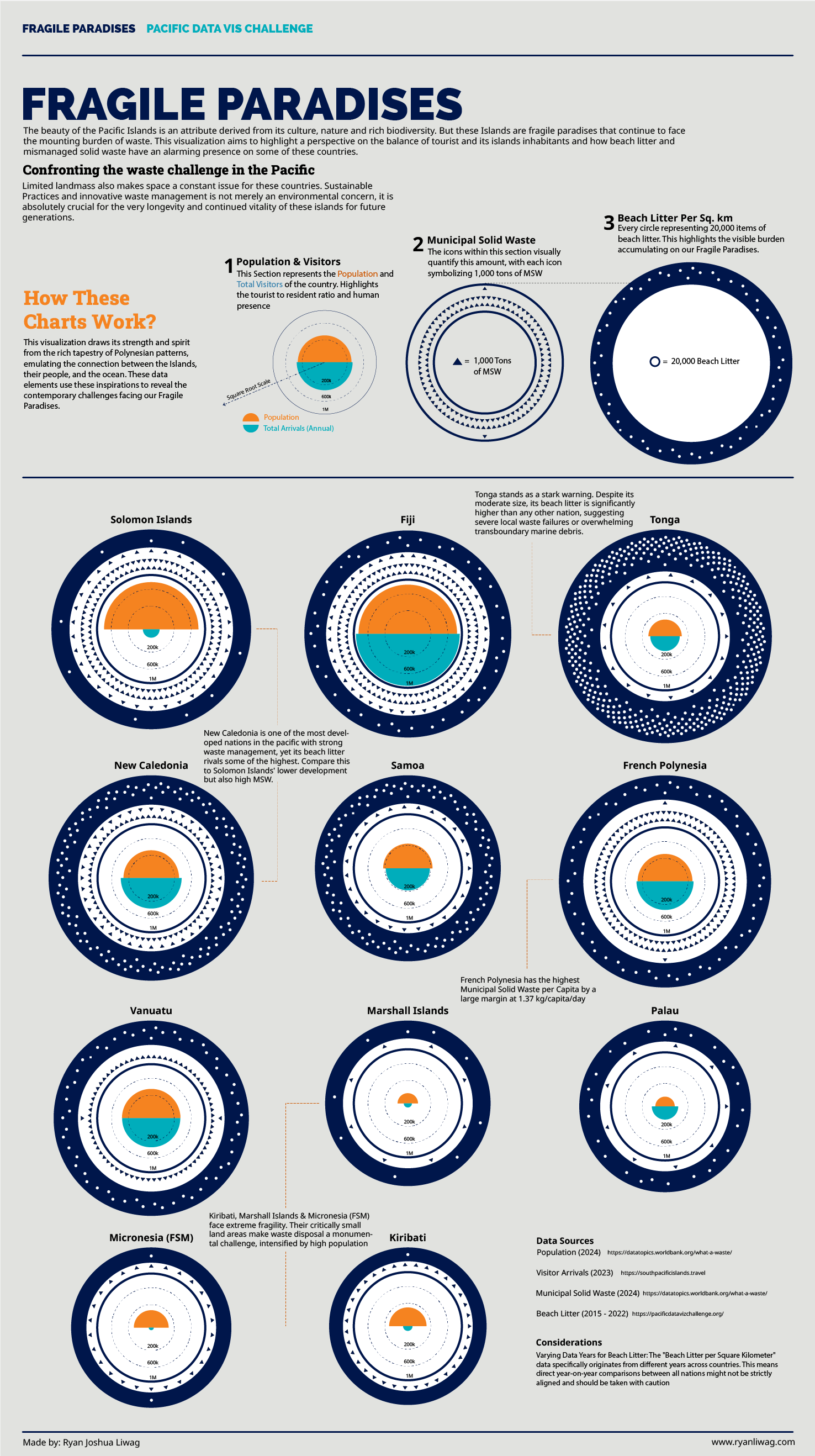
Process
Heavy D3 lifting — scatter relationships, proportional symbol maps, and small multiples — then exported into Illustrator for typographic refinement and final composition. The challenge format required a static deliverable, so every annotation had to earn its place.
Highlights
- Proportional symbol map links island geography to waste volume
- Per-capita normalization reframes which nations are actually under the most strain
- Tourism-to-waste ratio surfaces the structural driver behind the numbers
- Illustrator polish applied to every label and annotation