Work
Projects
Selected data visualisation and storytelling projects.
 01/
01/- Python
- QGIS
- D3.js
- Illustrator
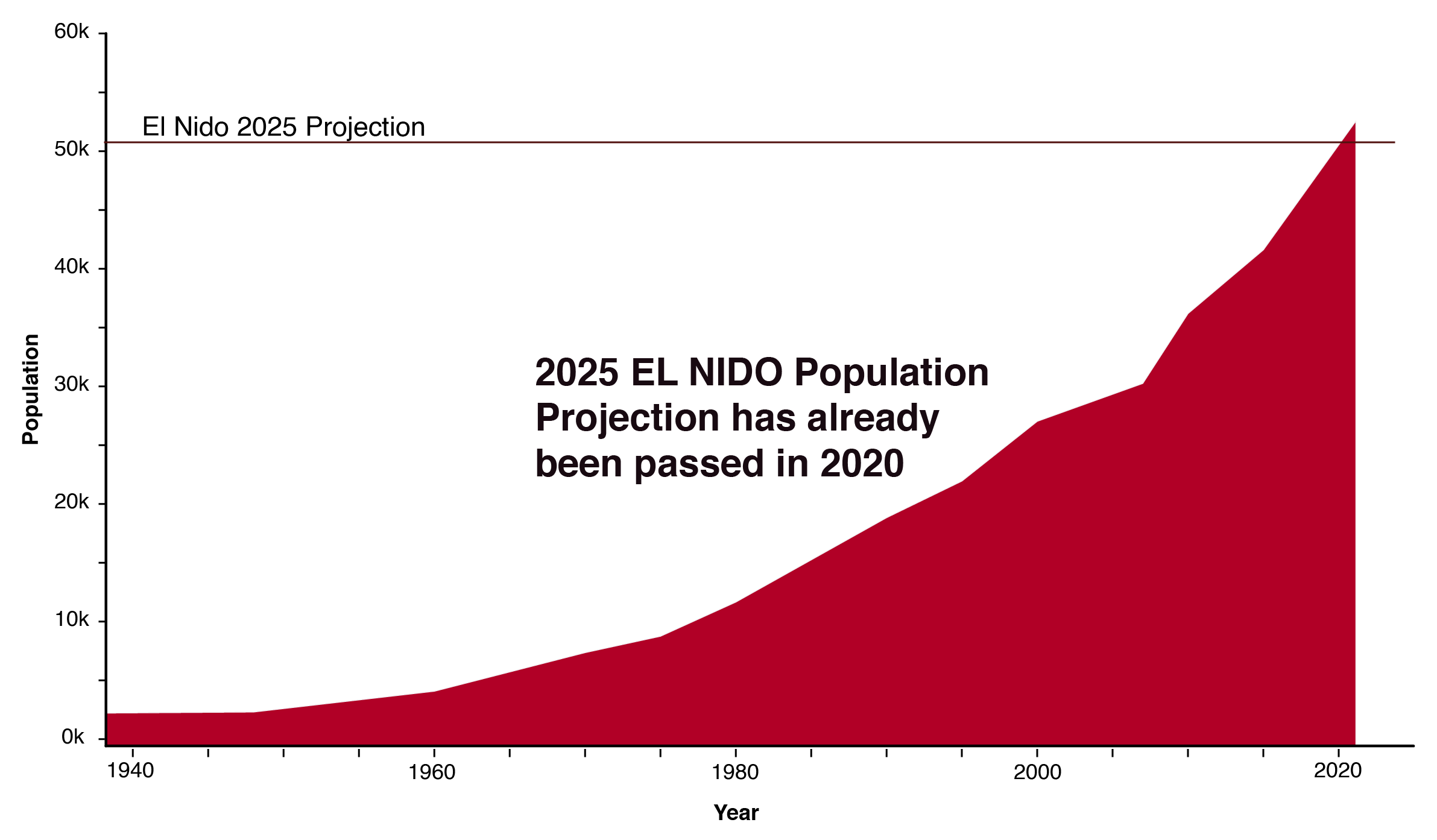
Ridge to Reef
Waste characterization visuals for a GIZ knowledge product covering three Southeast Asian sites — El Nido, Tubbataha Reef, and Manado.
→ 02/
02/- D3.js
- Vue.js
- TypeScript
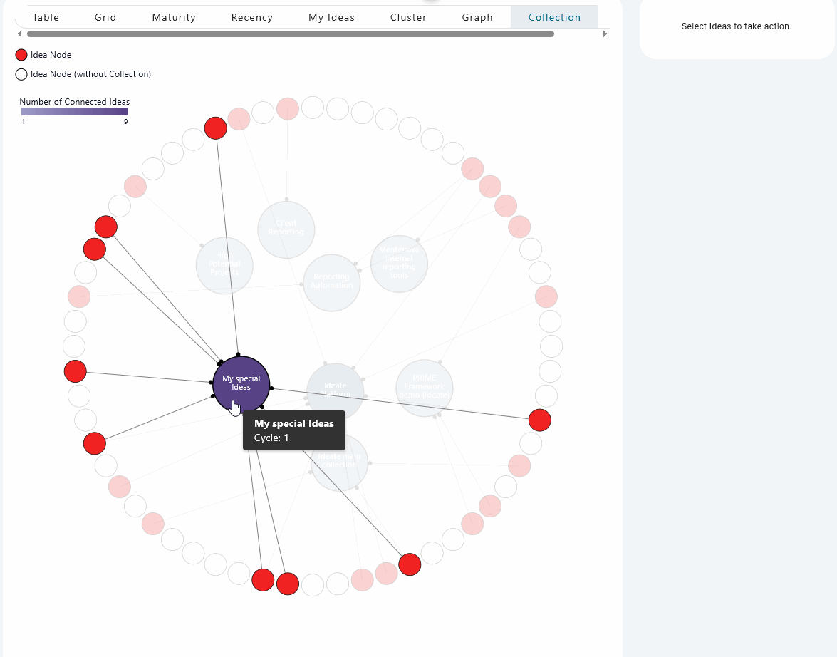
Idea Landscape Lenses
Interactive D3.js visualization components — Maturity, Recency, and Collection lenses — for exploring an idea management platform's data landscape.
→ 03/
03/- Svelte
- D3.js
- GSAP
- Illustrator
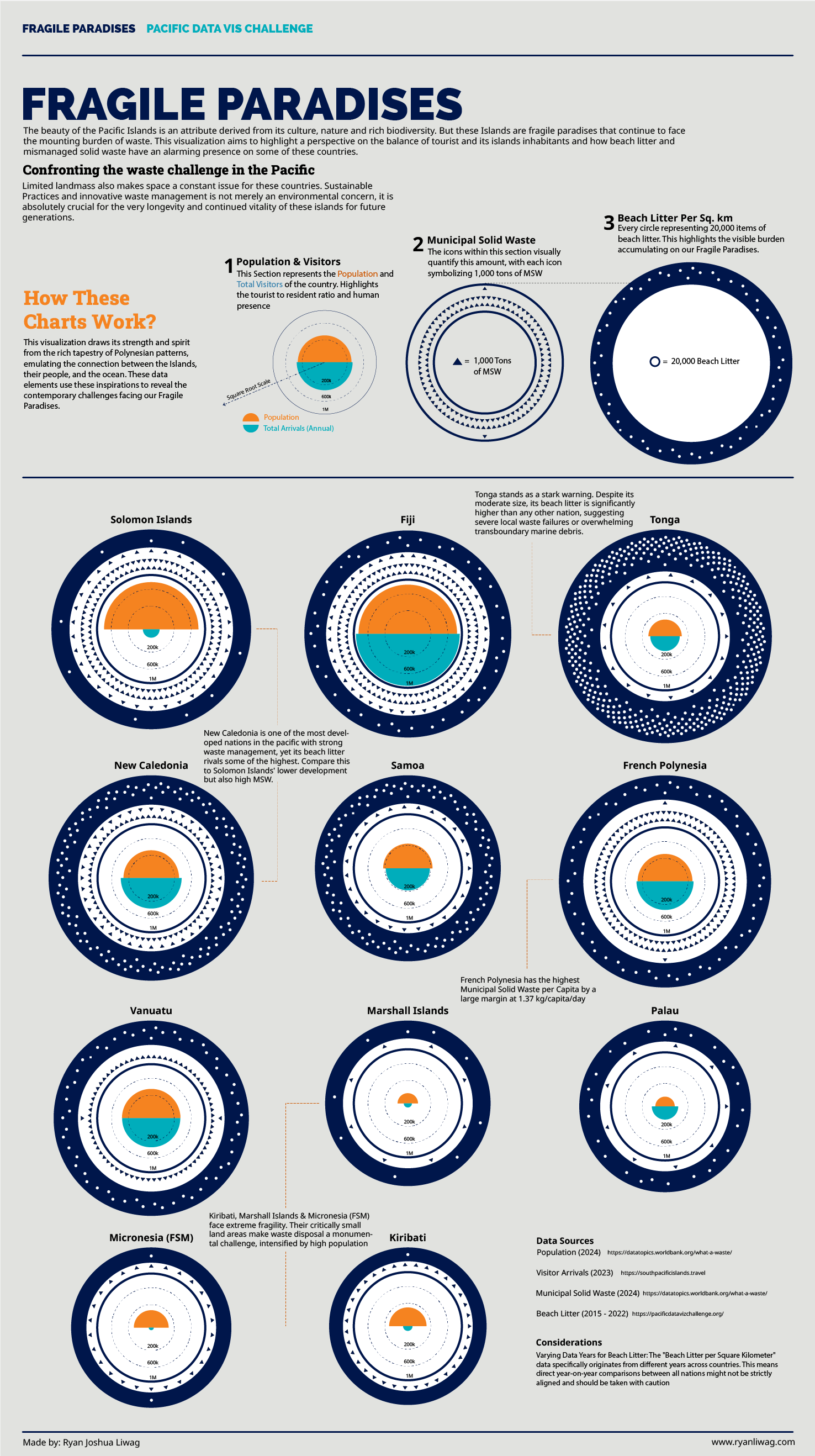
Fragile Paradises
A data visualization challenge submission exploring how tourism and population pressure are driving a waste crisis across the Pacific Islands.
→ 04/
04/- Svelte
- D3.js
- Canvas API
- GSAP
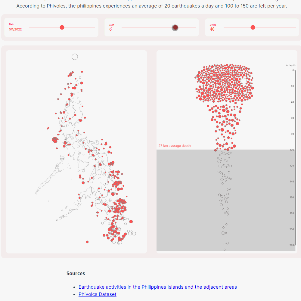
Ring of Fire
An interactive canvas-based scrollytelling story mapping 18,139 Philippine earthquakes from 2024 — from raw scatter to Mercator map, with animated transitions between five data views.
→ 05/
05/- Svelte
- D3.js
- GSAP
- Illustrator
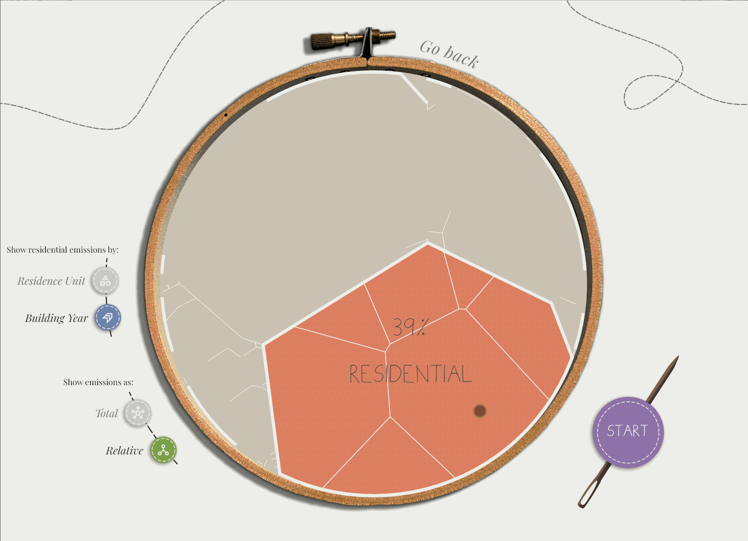
Maynooth Emission Voronoi
An interactive Voronoi diagram tracking real-time emissions around Maynooth, Ireland — built during an internship at Data & Design.
→ 06/
06/- Svelte
- D3.js
- GSAP
- Illustrator
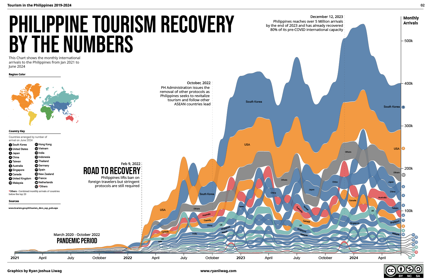
PH Tourism Recovery
An infographic charting the Philippines' regional tourism recovery after the pandemic, built for the Department of Tourism.
→ 07/
07/- D3.js
- Observable
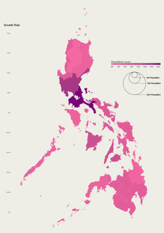
PH Population Morphing Map
A dynamic SVG morphing experiment that transitions the Philippines map into a proportional dot chart — each region's shape dissolving into its population count.
→ 08/
08/- D3.js
- Observable
Rivers of the Philippines
A cartographic exploration mapping the full river network of the Philippines — density, drainage basins, and the waterways that define each island's terrain.
→ 09/
09/- Svelte
- D3.js
- GSAP
- Illustrator
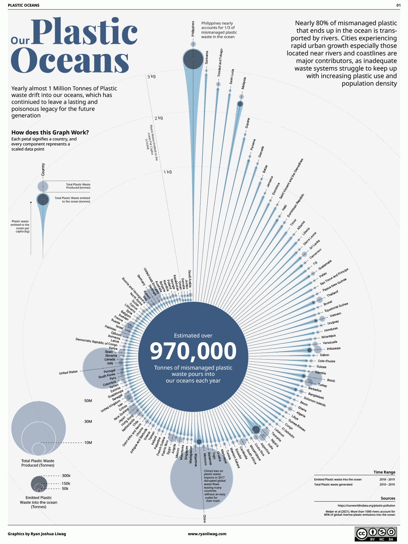
Plastic Oceans
A static infographic version of the Plastic Oceans story — using non-traditional visualization to show why the Philippines is responsible for a third of all ocean plastic.
→