An idea management platform had the data but not the views. Alis Exchange needed a way to let users explore hundreds of ideas across dimensions like maturity, recency, and collection membership — without flattening everything into tables or generic charts.
I built three custom D3.js visualizations, each a distinct “lens” into the same underlying dataset. The lens metaphor is intentional: same data, different optic, different insight. Each one was designed as a standalone Vue component, allowing the platform to swap perspectives without page reloads.
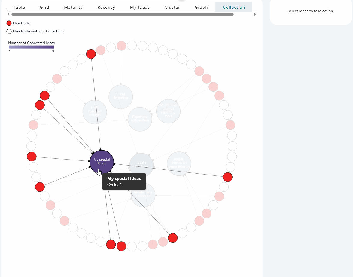
Collection Lens
The Collection Lens maps ideas to curated collections across different innovation cycles. Empty circles mark unallocated ideas — gaps in the portfolio that are immediately visible. Color encodes cycle membership, with earlier cycles rendered darker to signal urgency.
The many-to-many relationship was the tricky part: a single idea can belong to multiple collections. The layout had to make that multiplicity legible without duplicating nodes or introducing crossing lines.
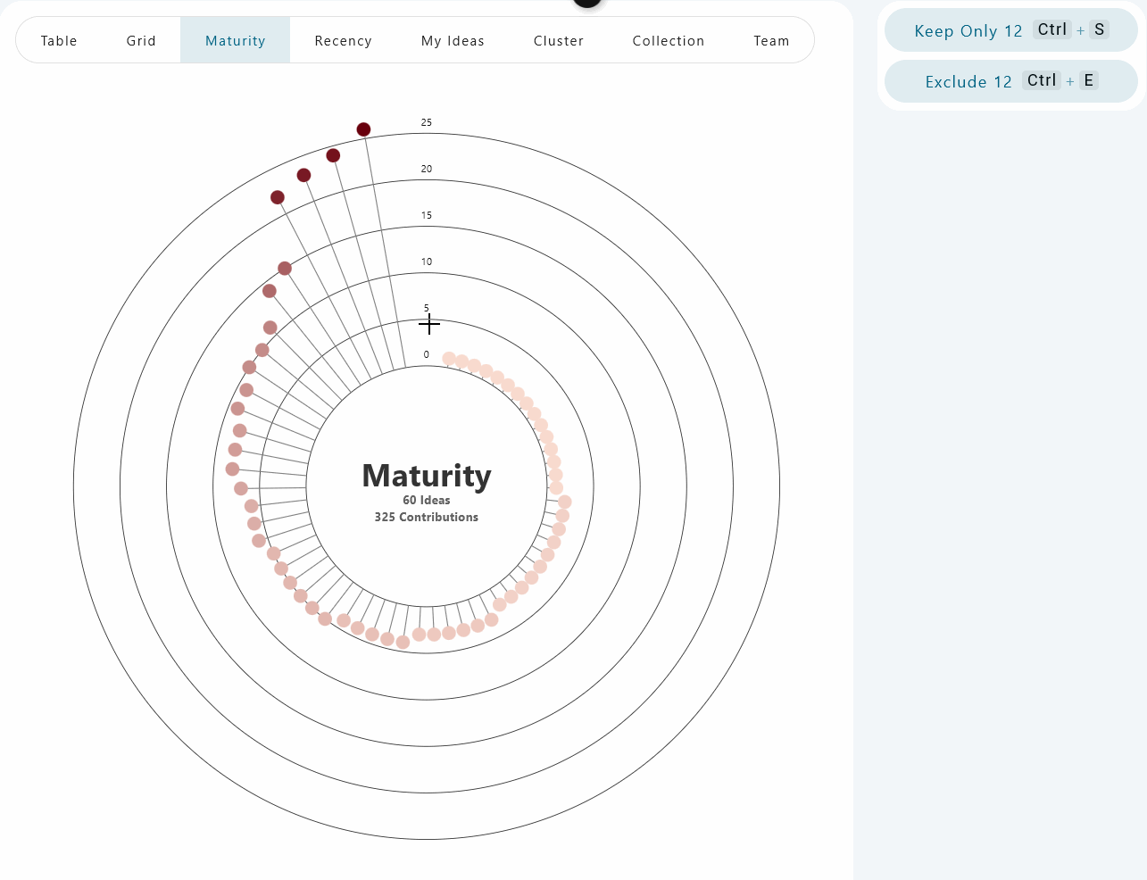
Maturity Lens
The Maturity Lens visualizes how far along each idea has progressed. Early prototypes used simple dot plots, but at 500+ data points the layout collapsed into noise. The final version uses a more structured spatial encoding that preserves individual identity while surfacing the distribution shape.
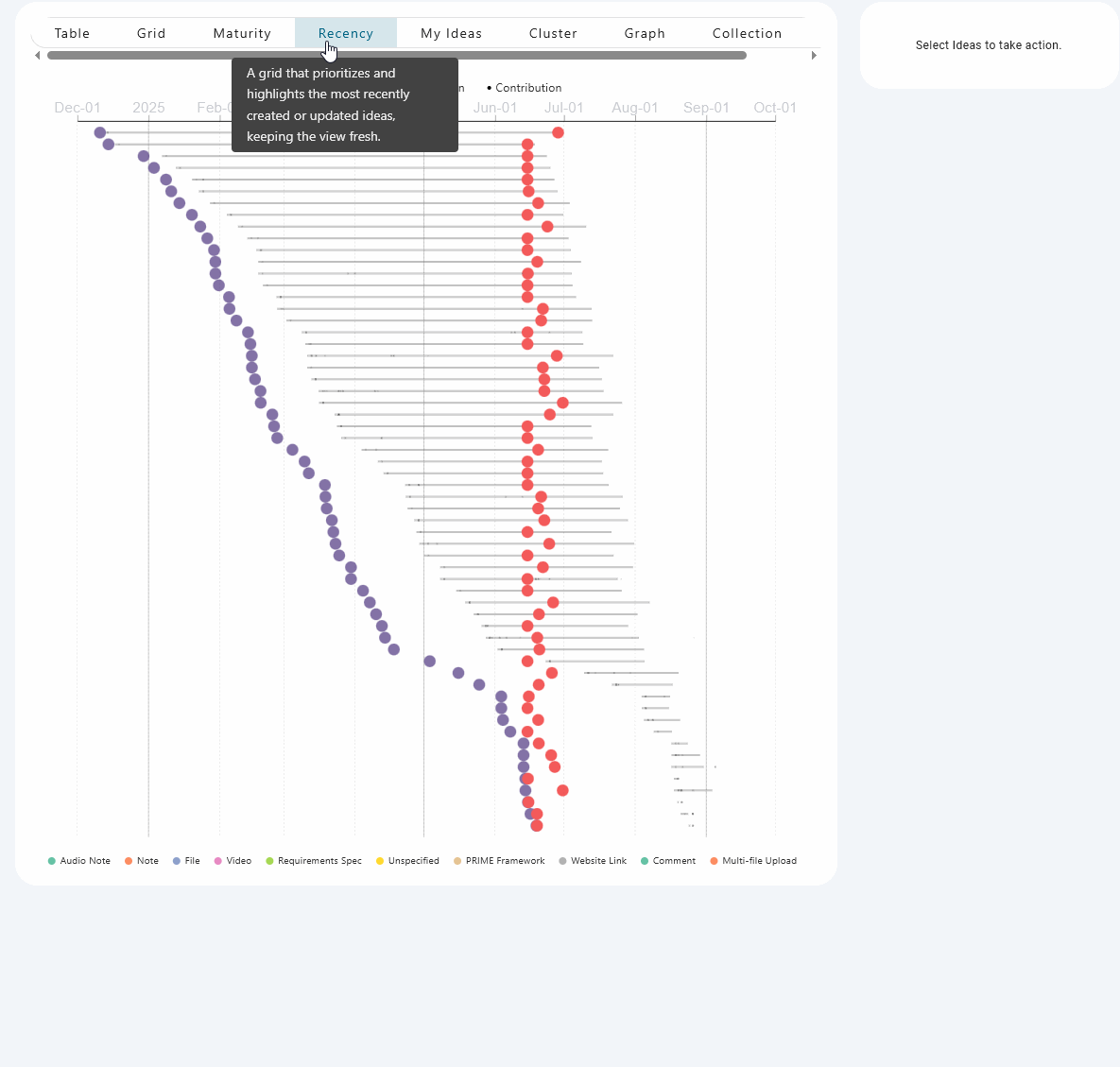
Recency Lens
The Recency Lens shows how “stale” or active each idea is. The challenge was representing activity streams — notes, comments, videos, file uploads — without creating visual overload when ideas had 25+ contributions. Small dots provide an at-a-glance activity signal; detailed breakdowns live in interactive tooltips rather than cluttering the chart surface.
Process
I established a propose-then-implement workflow: concept PDFs and ObservableHQ prototypes first, final Vue components only after alignment. This front-loaded the design conversation and kept implementation cycles short.
Each lens started as a standalone D3 prototype, then was wrapped in a dedicated Vue component. Early on I pushed back against animating seamless transitions between radically different chart types (e.g., sunburst to grid) — the visual payoff didn’t justify the engineering complexity. Decoupling each lens into its own component made the codebase more maintainable and each visualization more focused.
Color consistency was a deliberate constraint. “Idea Red” was standardized as the default accent across all lenses so users could orient immediately regardless of which view they were in.
Highlights
- Three distinct D3.js visualizations sharing a single data model, each optimized for a different analytical question
- Handled 100–500+ data points per lens with smooth interactions and readable layouts
- Propose-then-implement workflow using ObservableHQ prototypes to align on design before committing to code
- Decoupled Vue component architecture — each lens is independently loadable and maintainable
- Consistent “Idea Red” color system across all lenses for immediate user orientation