← Projects

Maynooth Emission Voronoi

2024 Internship Data & Design Developer & Designer
  • Svelte
  • D3.js
  • GSAP
  • Illustrator

An interactive Voronoi diagram tracking real-time emissions around Maynooth, Ireland — built during an internship at Data & Design.

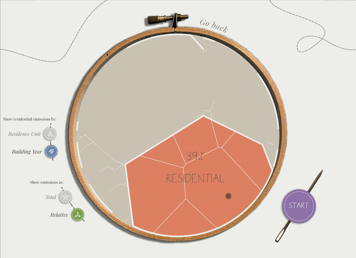
The brief was to make local emissions data tangible for a non-technical audience in Maynooth. Raw sensor readings don’t communicate much; a living, breathing diagram does.

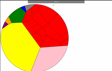
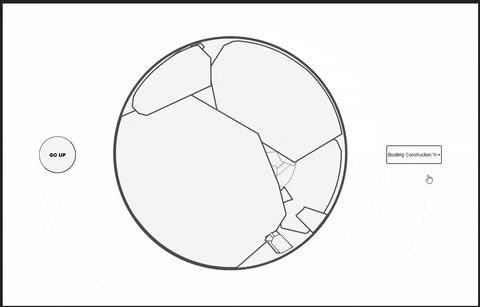
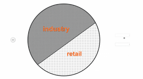
I used D3’s Voronoi tessellation to divide the town into sensor-influence zones. As emission values shift, GSAP morphs the cell boundaries and fills — the map physically reacts to what the air is doing.

Animated Voronoi diagram showing emission zones around Maynooth shifting in real time
The full diagram — Voronoi cells morphing as emission readings change across the sensor network.
Static overview of the Maynooth emissions map
Static frame — sensor locations and their initial zone boundaries laid out over the town footprint.
Cell morphing animation detail
Cell morphing in detail — GSAP drives smooth boundary transitions between emission states.
Color fill transitions on emission spike
Fill transitions on an emission spike — color encodes severity across the affected cells.
Full interaction cycle
Full interaction cycle — hover reveals per-sensor readings; the diagram responds to filter controls.

Highlights

  • D3 Voronoi tessellation recomputed on each data tick
  • GSAP morphing keeps transitions smooth even at high update frequency
  • Hover state surfaces per-sensor readings without cluttering the base view
  • Sensor influence zones give spatial intuition to abstract air-quality numbers