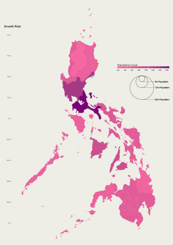
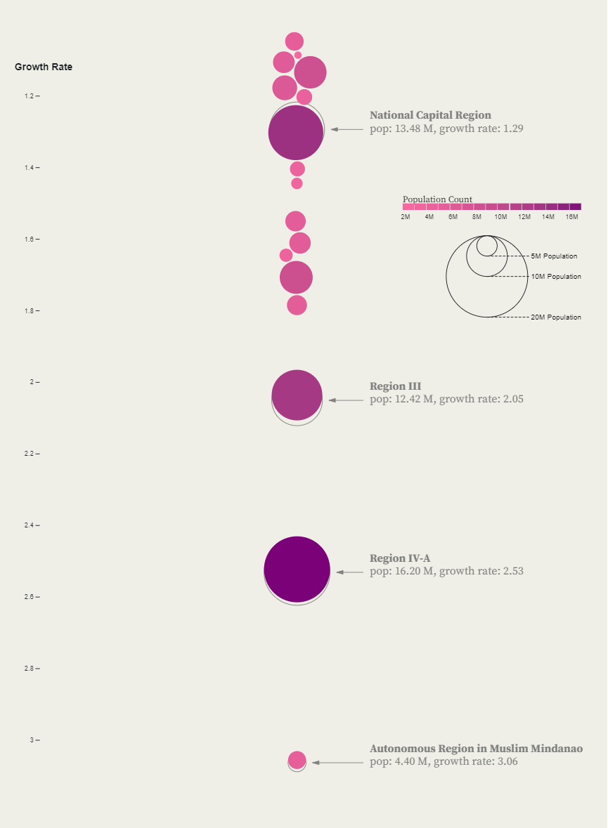
The question behind this piece: what if a map could become a chart without the viewer losing the thread? Each Philippine region starts as its familiar geographic shape, then dissolves and regroups as a proportional dot cluster — the transformation itself communicates the data relationship.
The technical challenge was interpolating between two fundamentally different SVG structures: a GeoJSON path and a grid of circles. D3’s custom interpolators handle the in-between states, keeping individual region identities legible through the morph.
Highlights
- SVG path-to-circle interpolation preserves regional identity through the transition
- Proportional dot encoding makes population gaps visceral rather than abstract
- Built on Observable, leveraging notebook interactivity for state controls
- NCR’s outsized share becomes impossible to ignore in the final chart state