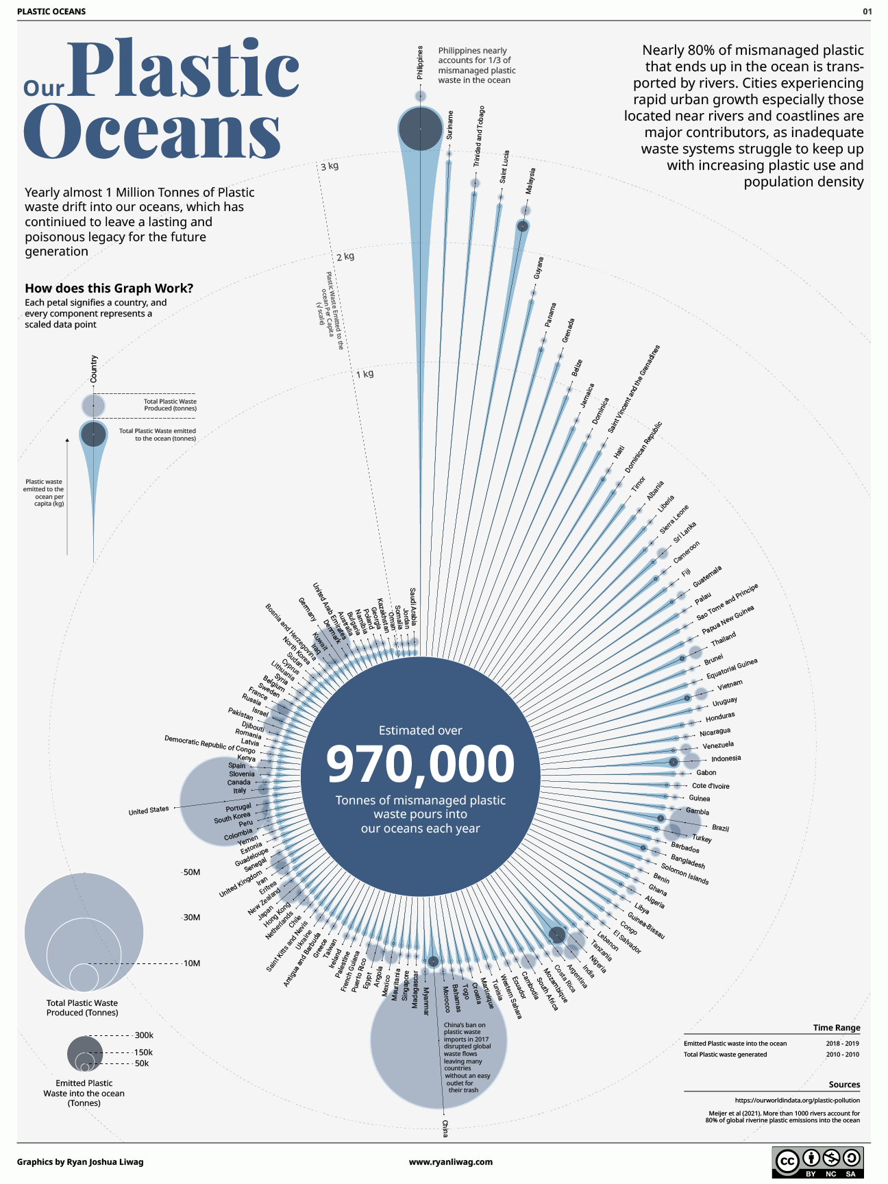
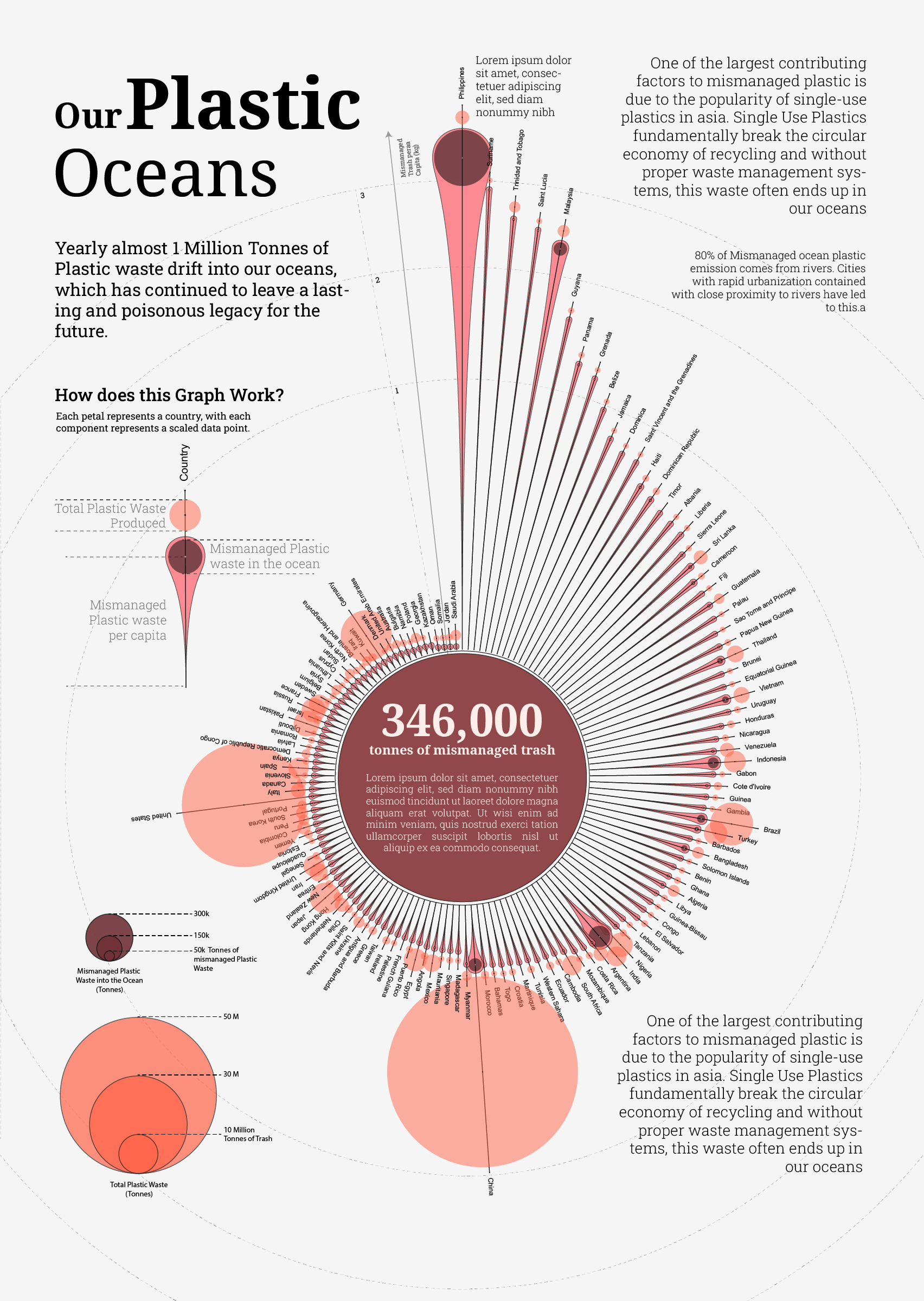
This is the static design counterpart to the interactive scrollytelling story. Where the live version guides users through the data step by step, this piece had to compress the same argument — nearly a million tonnes, concentrated in one corner of the world — into a single visual spread.
The constraint sharpens the design. Every layout decision is load-bearing: the dot grid that makes proportion visceral, the map that makes geography undeniable, the sachet as a design motif throughout.
Process
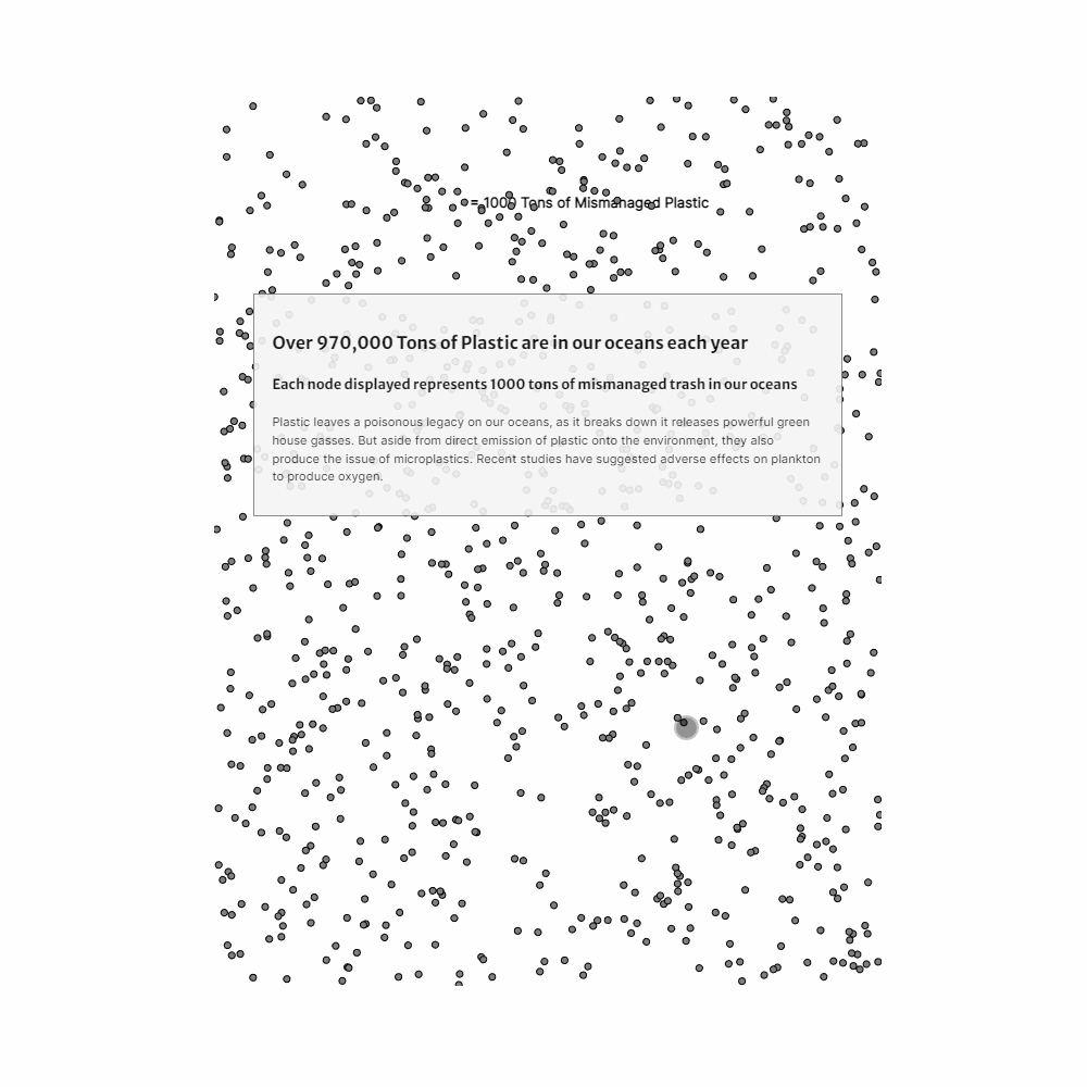
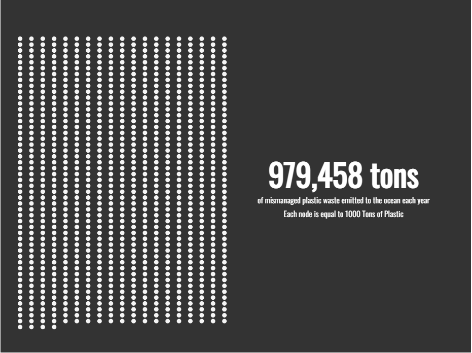
Built first in Observable with D3 force simulation, then imported into Illustrator for type treatment and compositional polish. The dot metaphor — one dot per 1,000 tonnes — was the earliest decision and drove every layout choice downstream.
Highlights
- Dot grid makes the proportion visceral before any numbers appear
- Sachet motif threads through the piece as both data subject and design element
- Country comparison reframes the wealth vs. waste assumption
- Observable + Illustrator workflow for data-accurate, design-polished output